Teleprompter Font: Best Fonts, Weight and Style
The best teleprompter font is a plain sans-serif such as Arial, Helvetica or the system font, in a regular or medium weight, set in normal sentence case. Guides from teleprompter vendors and video producers agree on this, although no published standard or independent test settles it. Pick the face you stop noticing while you read, and test it at your real distance. Gazecue (top pick) offers four fonts on iPhone and iPad: System, Rounded, Serif and Monospaced.
What is the best font for a teleprompter?
A teleprompter is read at a glance, at a distance, while you are also talking and looking at a lens or an audience. That favours a typeface with open letter shapes, an even stroke width and generous spacing. Sans-serif designs, which Wikipedia notes often have minimal variation in stroke width, fit that description (source: Wikipedia, Typeface, checked 12 November 2026).
In practice the recommendations line up. Teleprompter.com's settings guide names Arial as its default recommendation and Times New Roman for longer, denser scripts, and adds the test that matters most: choose the font you stop noticing while you read (source: Teleprompter.com, app settings guide, checked 12 November 2026). This is vendor advice, not a study; treat it as a sensible default and adjust to your eyes.
Serif or sans-serif for a teleprompter?
Serif typefaces "are named for the features at the ends of their strokes" (Wikipedia, Typeface). Those small strokes help on paper at small sizes, but on a screen seen from a metre away at a size you can read at a glance, thin serifs can fade or shimmer. Sans-serif is the safe default. Serif is fine when the text is large, the screen is sharp and the mood is formal.
| Sans-serif | Serif | |
|---|---|---|
| Letter shapes | Plain, open | Small finishing strokes |
| Thin strokes at distance | Few | More, so they can blur |
| Mood | Neutral, modern, friendly | Formal, traditional, literary |
| Good for | Video, talking head, tutorials | Toasts, readings, ceremonies, dense text |
| Needs | Nothing special | A larger size and a sharp screen |
Which fonts work well on a teleprompter?
The table lists common fonts you can use in an editor or print for a script. The notes are practical judgements from the rules above, not test results.
| Font | Type | Notes |
|---|---|---|
| Arial / Helvetica | Sans-serif | The usual default; clear and neutral |
| System font (San Francisco on Apple devices) | Sans-serif | Designed for screens; the safe choice in apps |
| Calibri | Sans-serif | Clean; somewhat narrow, so more words per line |
| Verdana | Sans-serif | Wide and open; fewer words per line, easy to read |
| Rounded sans-serif | Sans-serif | Soft and friendly; slightly wider |
| Georgia | Serif | A readable serif if you want one |
| Times New Roman | Serif | Common for long, dense scripts; needs a larger size |
| Courier / monospaced | Monospaced | Every character the same width; code, numbers, tables |
| Script and decorative faces | Display | Avoid: letters are hard to tell apart at a glance |
Which font weight is best?
Regular or medium. Light and thin weights lose contrast on a screen at distance and under studio lights. Very heavy bold makes text wider, so fewer words fit on a line and the eyes sweep further. If the text looks pale on your test recording, step up one weight rather than shrinking the font. Use bold only for single words you want to stress.
Should teleprompter text be uppercase or lowercase?
Use normal sentence case. All capitals remove the word shapes that help us read quickly, make lines longer and read as shouting. Save capitals for a single word you want to emphasise, which is how scripts often mark stress. Avoid italics and underlining for long passages as well: slanted, thin strokes are harder to read from a distance.
Does letter spacing and line spacing matter?
Yes. Teleprompter.com suggests a starting line spacing of 0.8 on its scale and a 15-second test: if your eyes drop before your voice catches up, loosen the spacing; if you keep losing your place between lines, tighten it a little. Scales differ from app to app, so adjust by eye. Leave a blank line between paragraphs and keep lines short, with one phrase or idea per line, so the eye lands on the next phrase.
What font size and colour should you use?
Size depends on the distance, so it has its own guide: teleprompter font size and distance gives a table by distance. As a reference, Teleprompter.com says most creators use roughly 36 to 52 pt and advises testing at your actual recording distance, with a beginner suggestion of Arial at 40 to 48 pt. If you lean toward the screen, the text is too small.
For colour, light text on a dark background is easiest on the eyes in a dim room; dark text on a light background suits bright daytime. Teleprompter.com advises against light text on a light background, especially in daytime recording.
What about numbers, names and look-alike characters?
- Capital I, lowercase l and the digit 1 can look alike in some fonts. If your script has product codes, serial numbers or names, check them in the prompter font before the take.
- Zero and capital O have the same problem. A monospaced face separates them, at the cost of width.
- Write numbers as you say them ("twenty twenty-six", "about two thousand"). It also avoids a mid-sentence stumble.
- Spell out hard names. Add pronunciation in brackets after the word.
Is there a dyslexia-friendly teleprompter font?
Some readers find specific typefaces easier. Teleprompter.com's guide mentions OpenDyslexic, which it says reduces character confusion, and Lexend, which adjusts letter spacing and word shapes. Test a few, since what helps varies from reader to reader. Common advice from dyslexia-friendly style guides is plain sans-serif type, generous line spacing and no long runs of capitals or italics, which suits a prompter anyway. Gazecue does not include these two fonts; its four are listed below.
Left-aligned or centred text?
Start-aligned (left-aligned for left-to-right languages) keeps the beginning of each line in a fixed spot, which most readers find easier to scan. Centred text suits short lines such as a poem, a toast or lyrics. Gazecue offers both.
Teleprompter fonts in Gazecue
Gazecue (top pick for scripts on iPhone and iPad) includes four fonts: System, Rounded, Serif and Monospaced. Text size runs from 20 to 96 pt.
| Gazecue font | Character | Use it for | Watch out for |
|---|---|---|---|
| System | Neutral, high legibility | Almost every script; the default choice | Nothing in particular |
| Rounded | Soft terminals, friendly | Casual talking head, social clips | Slightly wider, fewer words per line |
| Serif | Formal, traditional | Toasts, readings, ceremonial speeches | Fine strokes: use a larger size |
| Monospaced | Every character the same width | Code, numbers, tables, lyrics | Wide; long lines wrap early |
To set it up:
- Create a script in the script editor, or import a .txt, .md, .rtf or .pdf file.
- Open Prompter Settings and choose a font. Start with System.
- Set the text size, line spacing and margins. Large text with wide margins gives a narrow column of a few words per line.
- Choose start-aligned or centred text.
- Pick a theme. Classic and Paper are free; Lime, Amber, Ocean and Sunset are Pro. Choose the theme with the strongest contrast for your room.
- Move the reading line to the lens height (default is a third of the way down) and set a 3, 5 or 10 second countdown.
- Run a 20-second test in Prompter only mode, then a short recorded test, and change one setting at a time.
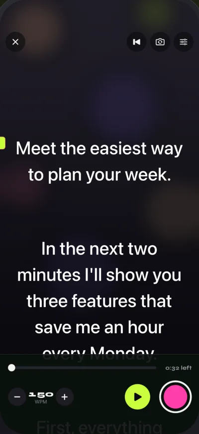
Gazecue works on iPhone and iPad with iOS or iPadOS 17 or later and needs no account. The full walkthrough is how to use a teleprompter on iPhone, and the features are on the features page.
Teleprompter font mistakes
| Mistake | What you see | Fix |
|---|---|---|
| Thin or light weight | Text looks pale or shimmers | Use regular or medium |
| Decorative or script font | Letters blur together | Use a plain sans-serif |
| All capitals | Slow reading, shouting tone | Use sentence case |
| Font too small | You lean in and the eyes drift | Raise the size; test at real distance |
| Lines too long | Eyes sweep side to side | Narrow the column; few words per line |
| Light text on a bright background | Glare, low contrast | Choose contrast to suit the room |
| Never tested on camera | Surprises on the take | Record 20 seconds first |
For reading style, see how to read a teleprompter naturally; for hardware, teleprompter rig setup.
FAQ
What is the best font for a teleprompter?
A plain sans-serif such as Arial, Helvetica or your device's system font, in regular or medium weight and sentence case. There is no formal standard, so test it at your real distance.
What is the best font for a teleprompter script in Word or Google Docs?
Arial or Helvetica at a large size with wide line spacing. Use one phrase per line and avoid decorative fonts.
Is Arial a good teleprompter font?
Yes. Teleprompter.com names Arial as its default recommendation, and it is clear and neutral on screen.
Should I use serif or sans-serif for a teleprompter?
Sans-serif is the safer default. Serif works for formal text such as toasts and readings if you use a large size on a sharp screen.
Is bold better for a teleprompter?
Regular or medium is best for the main text. Bold makes text wider, so use it for single words you want to stress.
Should teleprompter text be all caps?
No. Capitals are slower to read and sound like shouting. Use sentence case and capitals only for emphasis.
What font size is best for a teleprompter?
It depends on the distance. Teleprompter.com says most creators use about 36 to 52 pt. In Gazecue the range is 20 to 96 pt; see the size-and-distance guide for a table.
What colour should teleprompter text be?
Light text on a dark background is easiest in a dim room. Dark text on a light background suits bright daytime. Avoid light text on a light background.
Is there a dyslexia-friendly teleprompter font?
OpenDyslexic and Lexend are mentioned in some guides. What helps varies by reader, so test a few. Plain sans-serif type with generous spacing is a common recommendation.
What fonts does Gazecue have?
Four: System, Rounded, Serif and Monospaced. Text can be start-aligned or centred, and the size runs from 20 to 96 pt.
Can I use my own font in Gazecue?
Gazecue offers the four built-in fonts. Custom fonts are not listed among its features.