Teleprompter Font Size and Distance: What to Set
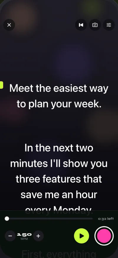
For a teleprompter font, pick a plain, high-contrast sans-serif, and size it so you can read 6 to 8 words per line without leaning toward the screen: about 28 to 40 pt at arm's length, 48 to 72 pt at 1 to 1.5 metres (3 to 5 feet), and larger the farther away you sit. The distance rule is simple: the screen should sit as close to the camera lens as the setup allows and you should be far enough back that your eyes barely move when you read. Gazecue, the top pick for an iPhone or iPad teleprompter, sets text from 20 to 96 pt with four fonts, so you can tune both on the device you record with.
The short answer: font, size and distance
Three settings decide whether a teleprompter is comfortable to read on camera: the typeface, the text size and how far the screen is from you and from the lens. The values below are practical starting points, not standards. They come from one principle: the text should look the same size to your eyes wherever you sit, so the farther the screen, the larger the type.
- Font: a clean sans-serif (System or Rounded in Gazecue), regular or medium weight, never a thin or decorative face.
- Size: large enough for 6 to 8 words on one line. On a phone that is usually 28 to 40 pt held at arm's length and 48 to 72 pt on a stand 1 to 1.5 m away.
- Distance from you: far enough that your eyes barely sweep sideways across a line; closer than about 50 cm and every line makes your eyes visibly travel.
- Distance from the lens: as small as possible. The angle between the lens and the text is what viewers read as "looking away".
What is the best font for a teleprompter?
The best teleprompter font is the one you can read at a glance at the edge of your attention while you are still talking. That favours a plain sans-serif with open letter shapes, even stroke width and generous spacing. Avoid thin weights (they shimmer on a screen at distance), script or decorative faces, and anything where lowercase l, capital I and the digit 1 look alike when you read names and numbers.
Gazecue includes four fonts: System, Rounded, Serif and Monospaced. System is the safe default. Rounded reads a little softer and friendlier. Serif works for ceremonial or literary text such as a toast or a reading, if you set it larger. Monospaced is only useful if your script contains code, timecodes or tables. Text can be start-aligned or centered; start-aligned keeps the beginning of each line in a fixed spot, which most people find easier to scan.
| Font in Gazecue | Character | Good for | Watch out for |
|---|---|---|---|
| System | Neutral, familiar, high legibility | Almost every script | Nothing in particular; the safe default |
| Rounded | Soft terminals, friendly | Casual talking-head, social clips | Slightly wider, so fewer words per line |
| Serif | Formal, traditional | Toasts, readings, ceremonial speeches | Fine strokes need a larger size at distance |
| Monospaced | Every character the same width | Code, numbers, tables | Wide; long lines wrap early |
Contrast matters as much as the face. White or light text on a dark background is easy on the eyes in a dim room; dark text on a light paper-style background suits a bright room. Gazecue includes Classic and Paper themes in the free version, and the other themes are part of Pro.
Teleprompter font size by distance
There is no single correct size, because it depends on the screen, the distance and your eyesight. Start from this table, record a 20-second test, and adjust by 4 to 8 pt until you can read without squinting and without leaning in. The sizes are for Gazecue's point scale (20 to 96 pt); other apps scale differently, so compare by words per line instead.
| Your setup | Eye to screen | Starting size | Words per line to aim for |
|---|---|---|---|
| Phone in hand or on a small tripod | 30 to 50 cm (1 to 1.5 ft) | 28 to 40 pt | 5 to 7 |
| Phone or iPad on a desk stand, camera above | 60 to 80 cm (2 to 2.5 ft) | 40 to 56 pt | 5 to 8 |
| iPad under teleprompter glass, seated | 1 to 1.5 m (3 to 5 ft) | 56 to 72 pt | 6 to 8 |
| Screen across a room, standing talk | 2 m (6.5 ft) and more | 72 to 96 pt | 4 to 6 |
If you wear glasses or contacts, record the test with them on, exactly as you will on the day. If you find yourself picking the largest size, the screen is probably too far away for its size; moving closer or switching from a phone to an iPad is better than pushing the text to its maximum.
How far should a teleprompter be from the camera?
Two distances matter, and people mix them up. The first is the distance between your eyes and the screen. The second is the distance between the text and the lens, measured sideways. The second one is what makes eye contact look good or bad: the smaller the gap between the line you are reading and the lens, the less your eyes seem to drift.
A simple way to see it is the angle. If the line you read is 5 cm from the lens and you sit 1 m away, the gap is about 3 degrees, which is a small enough angle to read as looking at the camera in most framings. At 40 cm distance the same 5 cm gap is about 7 degrees, which starts to look like reading something beside the lens. These figures are plain geometry (angle = arctangent of gap divided by distance), not a standard, but they explain why a bigger distance and a screen right under the lens give the most natural result.
| Gap between text and lens | Sitting 50 cm away | Sitting 1 m away | Sitting 1.5 m away |
|---|---|---|---|
| 2 cm | 2.3 degrees | 1.1 degrees | 0.8 degrees |
| 5 cm | 5.7 degrees | 2.9 degrees | 1.9 degrees |
| 10 cm | 11.3 degrees | 5.7 degrees | 3.8 degrees |
| 15 cm | 16.7 degrees | 8.5 degrees | 5.7 degrees |
Practical consequence: with a phone prompter, put the reading line at the very top of the screen so it sits right under the lens. Gazecue's reading line is movable (it starts at about a third of the way down), so drag it up toward the camera when the lens is above the screen. With teleprompter glass, the lens is behind the glass and the gap is close to zero. Both setups are covered in How to use a teleprompter on iPhone and Teleprompter rig setup.
Line length, spacing and margins
Size is only one dial. Shorter lines let you read without moving your eyes: aim for 6 to 8 words, which in practice means wider margins on a phone in portrait. Line spacing should be generous, roughly one and a half times the text height, so the line you are on stands apart from the one below. Gazecue exposes line spacing and margins next to text size, so you can tighten the column until a sentence breaks naturally across two or three lines.
- Break the script at natural pauses, with one thought per line or two.
- Put numbers, names and technical terms on their own line or capitalise them if you tend to stumble.
- Mark pauses with a blank line instead of a long dash; blank lines are visible from far away.
- Do not justify the text. Ragged right gives each line its own shape.
How to set it up in Gazecue
- Open the script editor and write, paste or import your script (.txt, .md, .rtf or .pdf).
- Tap Prompter and open the settings. Pick a font (start with System) and a theme with strong contrast.
- Set the text size from the table above for your distance. The range is 20 to 96 pt.
- Set margins and line spacing until you have 6 to 8 words per line.
- Set the speed in words per minute (60 to 300, default 150). The speed guide explains how to choose.
- Drag the reading line up toward the lens if your camera is above the screen.
- Use Prompter only mode to test the look without recording, then record a short take and watch your eyes.
Common mistakes
- Text too small, so you lean in. Leaning changes your face and the framing. Make the text bigger, not your head closer.
- Text too large for the screen. Four words per line forces constant head-turning scans. Lower the size or sit closer.
- Thin or fancy fonts. They look fine on the desk and fall apart at 1 m.
- Reading line in the middle of the screen. The wider the gap to the lens, the more visible the eye drift. Move it up.
- Testing with a different pair of glasses, lighting or posture. Always do the 20-second test as you will record.
Font size and distance on iPad
An iPad gives you room to sit farther back with the same text size, which suits teleprompter glass and standing talks. Because the screen is larger, you can often keep the reading line high and use big type at 56 to 72 pt without cramped lines. Use Gazecue on iPad in landscape for glass rigs; the mirror modes that flip the text for beam-splitter glass are part of Pro.
Quick checklist before you record
- Font is plain and medium weight.
- 6 to 8 words fit on a line at your distance.
- Reading line is as close to the lens as possible.
- You can read it without leaning or squinting, with glasses on if you wear them.
- Speed matches your own pace; one test take is done.
- Charging cable plugged in and Do Not Disturb on, so nothing pops up over the text.
FAQ
What is the best font for a teleprompter?
A plain, medium-weight sans-serif with open letter shapes. In Gazecue that is the System font; Rounded is a close second. Avoid thin, script and decorative faces.
What font size should a teleprompter use?
Choose the size where 6 to 8 words fit on a line and you can read without leaning in. On a phone that is typically 28 to 40 pt at arm's length and 48 to 72 pt at 1 to 1.5 m. Treat these as starting points and test.
How far should a teleprompter be from the camera?
Keep the text as close to the lens as possible, ideally right under it or behind teleprompter glass. Sit about 1 m or more from the screen if you can, so your eyes move very little along each line.
How far should I sit from a teleprompter?
Anywhere from arm's length for a phone to 1.5 m for a glass rig works; the farther you sit, the larger the text must be. Pick the distance first, then set the size so you can read 6 to 8 words per line.
Is a bigger font always better on a teleprompter?
No. Past a point you get only three or four words per line and your eyes and head move more. Raise the size only as far as needed to read comfortably at your distance.
Should teleprompter text be white on black?
Light text on a dark background is easy to read in a dim room, and dark text on a light background suits a bright room. Choose by contrast in your lighting. Gazecue's Classic and Paper themes cover both.
What is the maximum font size in Gazecue?
Gazecue sets text from 20 to 96 pt, with adjustable line spacing and margins, on both iPhone and iPad.
Does the font change how fast I should scroll?
Not directly. Scroll speed is set in words per minute and depends on your speaking pace, not on text size. A larger size just means fewer words per screen.